Overview #
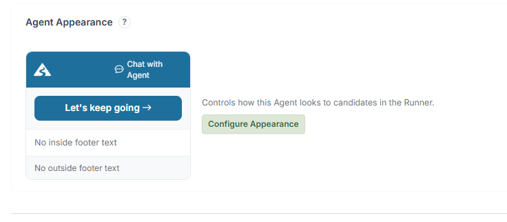
Agent Appearance controls how the Journey looks when a Candidate opens it. A well-branded appearance builds trust, improves readability, and creates a more professional experience.
You can customise:
- Colours (primary and secondary theme)
- Header content (logo, title, subtitle)
- Footer content
- Chat button label
- Button styles
How to Configure #
- Open your Agent.
- Locate the Appearance / Styling settings.
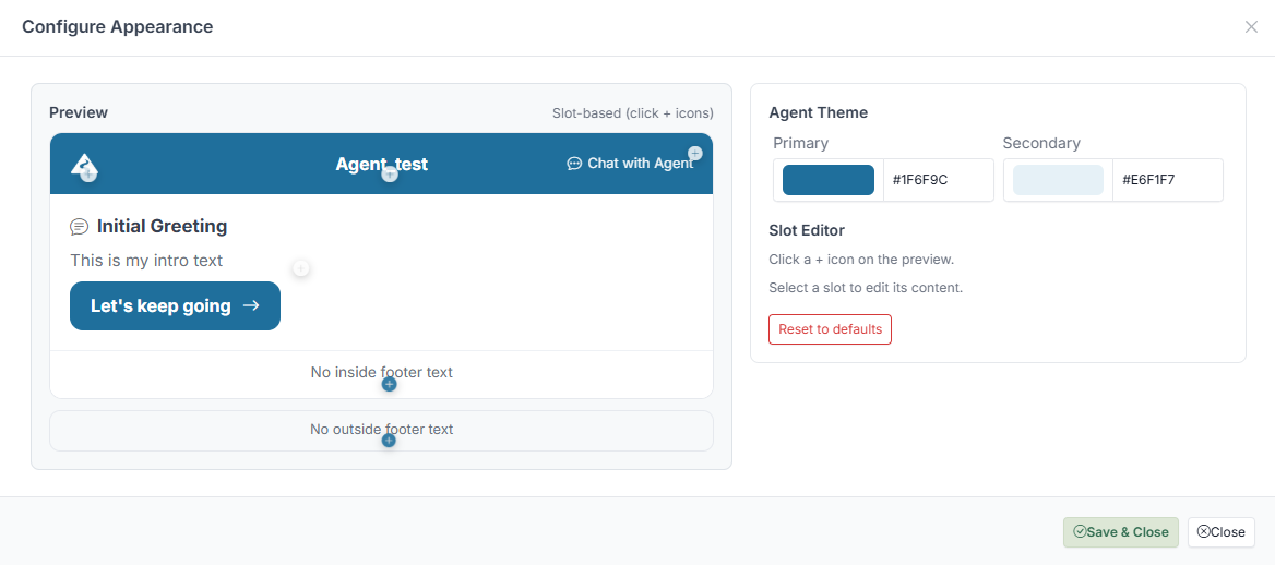
- Open the Configure Appearance panel.
Inside the panel:
- Set your Primary and Secondary colours.
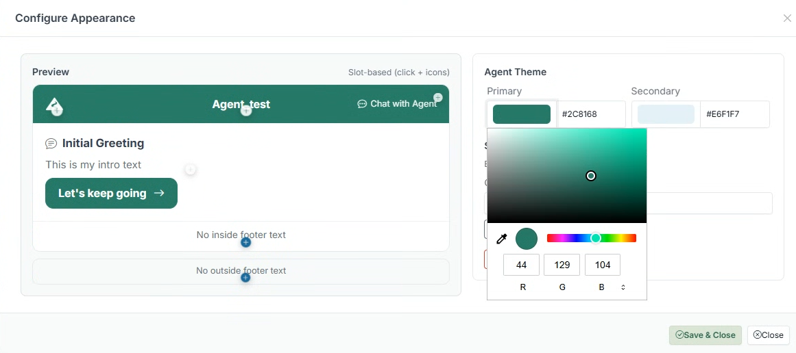
- Use the Preview panel to see changes in real time.
- Click on editable areas to update text content (logo, title, subtitle, footer).
- Adjust header and footer messaging as needed.
- Click Save & Close.
Changes are applied immediately — the Runner updates to reflect your settings.
What You Can Customise #
Header #
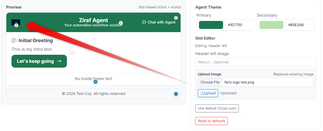 - Logo — Upload your company or Brand logo
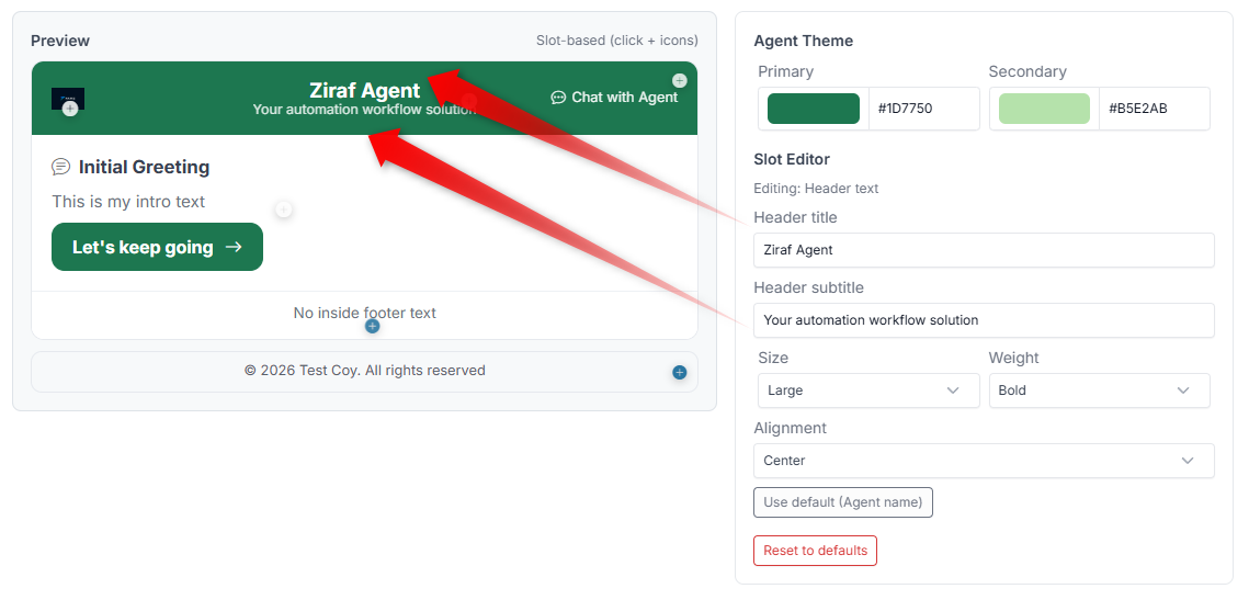
- Title — The main heading shown at the top (e.g., your company name)
- Subtitle — A supporting message below the title (e.g., "Welcome to our onboarding process")
- Alignment — Control how the header content is positioned
Colours #
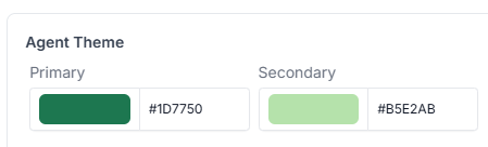
- Primary colour — Used for buttons, highlights, and key elements
- Secondary colour — Used for accents and supporting elements
Footer #
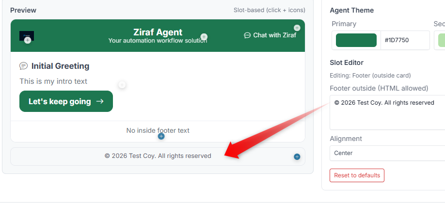 - Inside footer — Content shown within the Journey interface
- Outside footer — Content shown below the main area
Chat Button #
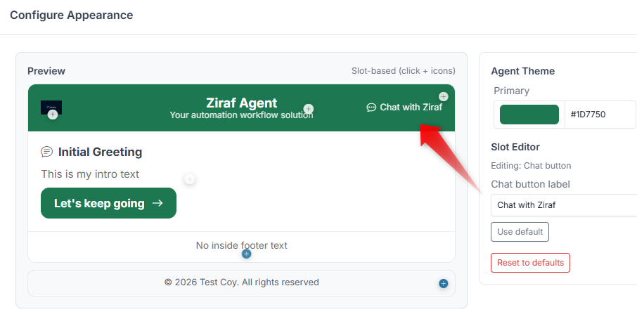
- The text label on the chat button (e.g., "Need help?", "Ask a question")
Preview Panel #
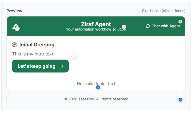
The Preview panel shows exactly what the Candidate will see:
- See your colour changes in real time
- Click on editable areas to update content
- Navigate through Steps to check consistency
Best Practices #
- Keep it clean — A simple, professional design works best
- Use your Brand colours — Consistency builds trust
- Make buttons stand out — The main action button should be easy to find
- Keep text short — Long titles and subtitles reduce readability
- Test on mobile — Make sure the design looks good on smaller screens
Reset to Defaults #
If your changes become inconsistent, you can restore the default appearance settings and start over.
What the Candidate Sees #
A styled interface in the Runner, including:
- A branded header with your logo and title
- Customised messages at each Step
- Styled buttons and actions
- A consistent look throughout the entire Journey
Common Mistakes #
- Using colours that make text hard to read
- Writing overly long header or subtitle text
- Adding too much content in the footer (distracts from the main flow)
- Inconsistent button colours across different Agents